Visual identity of Blanchette Lab
Discover our logo and the meaning it carries for our team.
Meaning of the elements that make up the logo
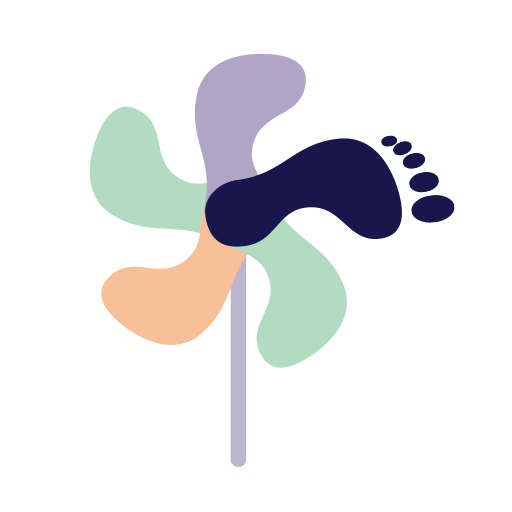
The foot is the common denominator in the work of the Blanchette Lab team. Each shape corresponds to the silhouette of a foot, both as the crow flies or in profile. As the crow flies, we can obviously see the trace of a foot and toes. From the side, it looks more like a boot. Together, they form both a winddrift and a spinning wheel. The virevent is playful and counter-inertia, testifies to the team’s desire to make a difference and recalls its expertise in knowledge translation. The notion of wind is a nod to this energy source that reminds us of sustainability and by the same token, sustainable health. The wheel illustrates the advancement of knowledge and the strength of the collective that characterizes the team. By circling around a central point, it can also illustrate that care is person-centered. Finally, the different colors testify to the diversity of backgrounds, expertise and cultures within the team that moves forward together for the health of the feet, one step at a time.
Logo created by Anne-Marie Cardinal from Vitam, based on a co-construction workshop with my members of Blanchette Lab.